
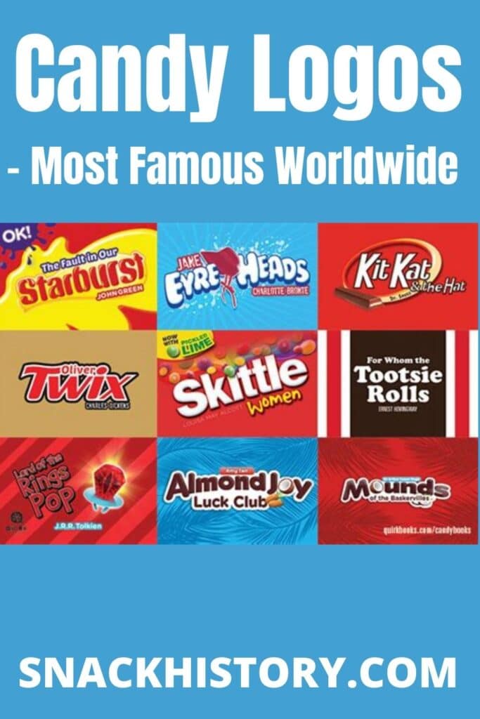
Candy Logos: History, Brands & Trivia
Please leave a review or any memories of this snack in the comments at the end of this post.
Snack History Nostalgia Rating: ⭐⭐⭐⭐☆
Ever wondered how much time candy brands spend on creating unique candy logos that are creative, informative, and inspiring all at the same time?
Logos are the symbols of the brand. It builds the image and gives individuality. There are some very famous candy logos on the market, and with just one glance, we can guess what it represents and which candy it belongs to. And as for our favorite treats, seeing the familiar candy logos just brings warm emotions connected to the specific sweets.
Follow the article to explore the logos of some of the most famous and loved candies.
| Candy Logos | Facts |
|---|---|
| Introduced | Varies by brand; Snickers logo first introduced in 1939 |
| Manufacturer | Various; including Mars, Inc., Mondelez Int., Impact Confections, and Wrigley Company |
| Candy Type | Chocolate bars, button-shaped candies, lollipops, and sour candies |
| Original Flavors | Chocolate, fruit, hazelnut, and sour varieties across featured brands |
| Still Available | Yes; all featured candy brands remain available on the market |
| Country of Origin | Various; including USA, England, Switzerland, and Spain (Chupa Chups) |
| Parent Company | Mars, Inc. owns Snickers, M&M's, Mars Bar, and Skittles (via Wrigley); Mondelez owns Milka |
Candy Logos Timeline
- 1932 — Mars bar chocolate established as a major candy manufacturer
- 1939 — Snickers logo first introduced with star symbol and black nameplate
- 1940s — M&M's logo introduced, representing creators Mars and Murrie
- 1969 — Salvador Dali finalizes and launches the iconic Chupa Chups logo
- 1979 — First Ferrero Rocher logo launched in black with white background
- 1982 — Ferrero Rocher logo redesigned; basis for today's version established
- 2000s — Mars bar logo designed with red wordmark on black oval background
- 2005 — Snickers logo redesigned with thinner frame and white letter shadows
Candy Logos vs Kit Kat
| Feature | Candy Logos | Kit Kat |
|---|---|---|
| Texture | Snickers: chewy nougat, caramel, and chocolate coating | Kit Kat: crispy wafer layers covered in chocolate |
| Introduced | Snickers: 1930 (bar); logo first noted 1939 | Kit Kat: 1935 |
| Manufacturer | Mars, Inc. | Nestlé (international); Hershey (USA) |
| Flavors | Original chocolate; various limited editions | Milk chocolate; wide range of flavor varieties worldwide |
| Price Range | Approximately $1–$2 per standard bar | Approximately $1–$2 per standard bar |
| Availability | Available worldwide in most major markets | Available worldwide in most major markets |
| Calories | Approximately 250 calories per standard bar | Approximately 210 calories per standard 4-finger bar |
Top 10 Most Popular Candy Logos
Snickers
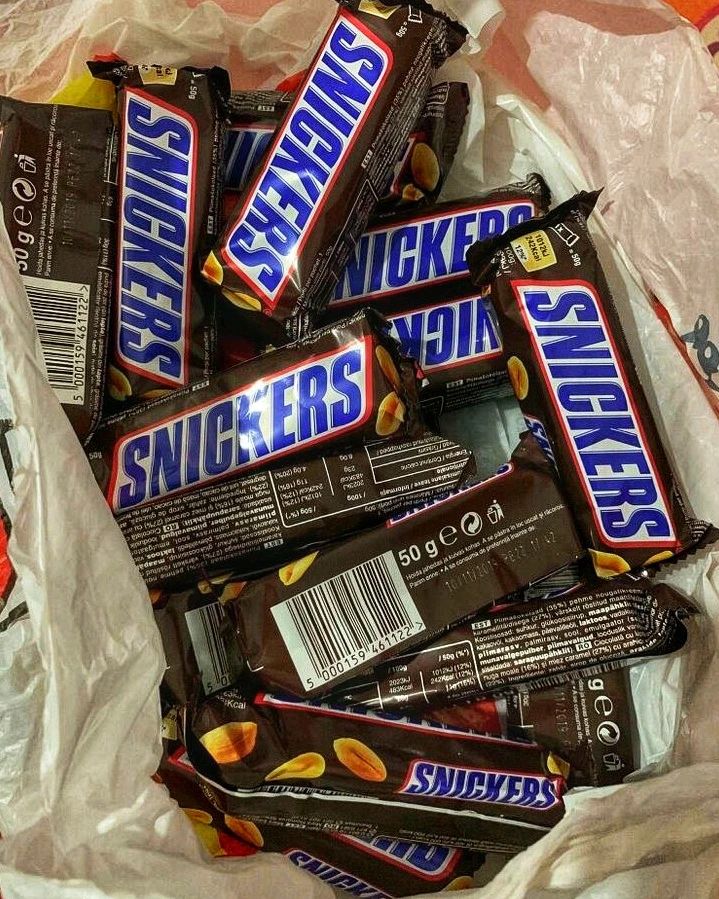
Snickers is one of the most famous chocolate bars, which is definitely much more than just a sweet treat. Instead, this chocolate bar fills us with energy and boosts our mood. The Snickers logo was first introduced in 1939. “Snickers” is written in all capital letters. In the first version, there was a little star symbol on the left side of the logo. The logo is on the black nameplate and brown outline. This is to resemble the outline.
After that time, the modification of the logo happened several times. The logo was redesigned in 2005. The logo frame became thinner and the capital letters stood at the same height. Also, letters gained a thin, white shadow, giving them volume.
M&M’s
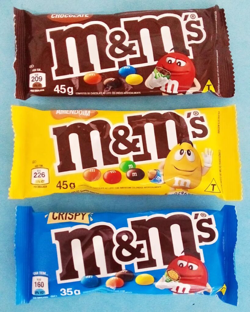
Little colorful button-shaped candies, with a hard, crunchy shell and filled with delicious sweet chocolate, are undoubtedly loved by all. The logo of this popular candy has a long history and actually contains the initials of the candy creators.
M&M’s logo is considered to be one of the most famous candy logos, especially when it comes to candies from the 1940s. Have you ever heard anything about the scandalous story behind M&M’s name? Well, just like the logo, the name of this candy is simple but meaningful. The first “M” represents Mars (Forrest Mars Sr.) and the second “M” letter is the representation of Murrie (Bruce Murrie).
Skittles
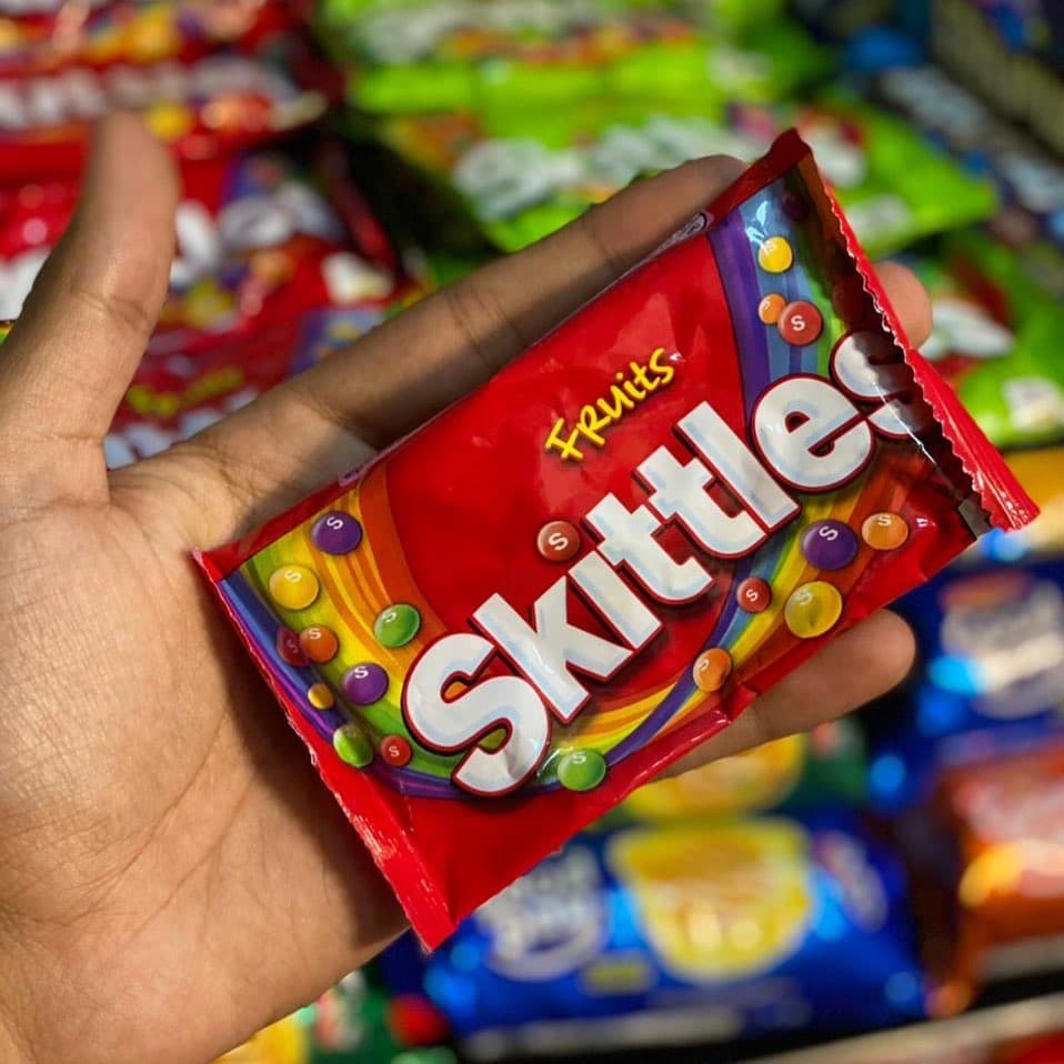
Skittles are button-shaped candies that look similar to M&Ms, but have a totally different filling and, therefore, taste. The candy was invented in England, but it is now owned by Wrigley Company, a division of Mars, Inc.
Skittles has modified its candy logos several times. The current version includes the image of colorful skittles itself, lying on the rainbow. Over the image, there is the wordmark, “Skittles.” There are two main colors in the logo: red and white.
Quick Quiz
Which Of These Is The Oldest Candy?
Milka
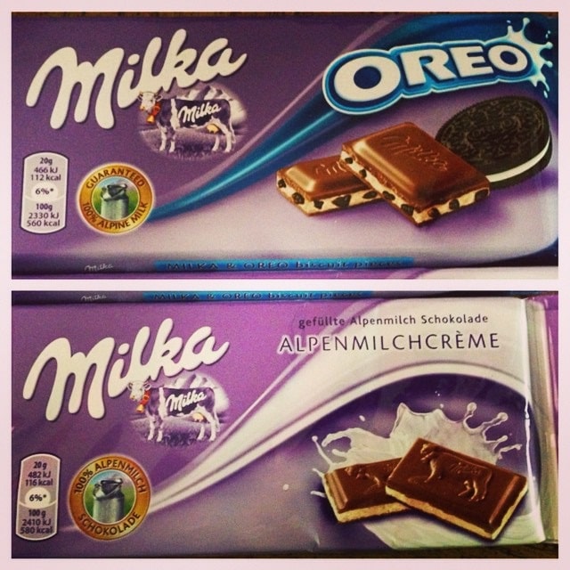
Delicious Milka Swiss Chocolate is considered to be one of the most famous chocolates of the 1900s. Currently, it is owned by Mondelez Int. The packaging and logo actually bring us back to Switzerland, where it was presented in a lilac-colored package. The purple color is a representation of luxury, but not obtrusive. The color role in this particular one is different and more significant than in any other candy logo.
The font looks like flowing milk actually, which represents the chocolate candy’s nature itself, rich in milk. The name of the candy was actually the merger of two German words: “milk” and “cocoa.”
Chupa Chups
You can hardly find a single person who hasn’t heard about the legendary Salvador Dali. But did you know that the Chupa Chups logo was actually designed by him? The very first marketing campaign for candy was to create an iconic logo and slogan, “It’s round and long-lasting.” The logo was finalized and launched in 1969.
The shape of the logo is flower-like, and it has a light yellow color. The “Chupa Chups” in red is written over the yellow background, and it creates the perfect balance of colors. Those two words are written differently: “Chupa” has more of the steady fond and “Chups” letters are more “wavy” or “flowy”.
Mars
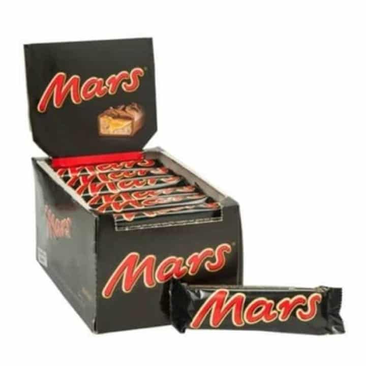
Here comes the famous Mars bar chocolate, which has been considered one of the main manufacturers of chocolate candy bars since 1932. The logo has a wordmark that is typed in a smooth and modern typeface.
The logo was actually designed later on, in the 2000s. “Mars” is written on the black oval background. And the writing is actually in red, with a light yellow lining along with the letters. All that gives the logo a classy look.
Ferrero Rocher
Ferrero Rocher is considered a classy candy, with a soft and sweet taste rich in hazelnuts. So it is not surprising that Ferrero Rocher’s logo is among the most classy candy logos. However, the logo was replaced several times.
In 1979, the first logo was launched, and it was mainly in black with a white background. The logo was redesigned in 1982, and today’s version is just a bit modified. The logo has a capital letter “Ferrero Rocher” wordmark. Letters are in a warm brown color and have either a white or gold background. Ferrero Rocher has various candy logos for different products.
Warheads
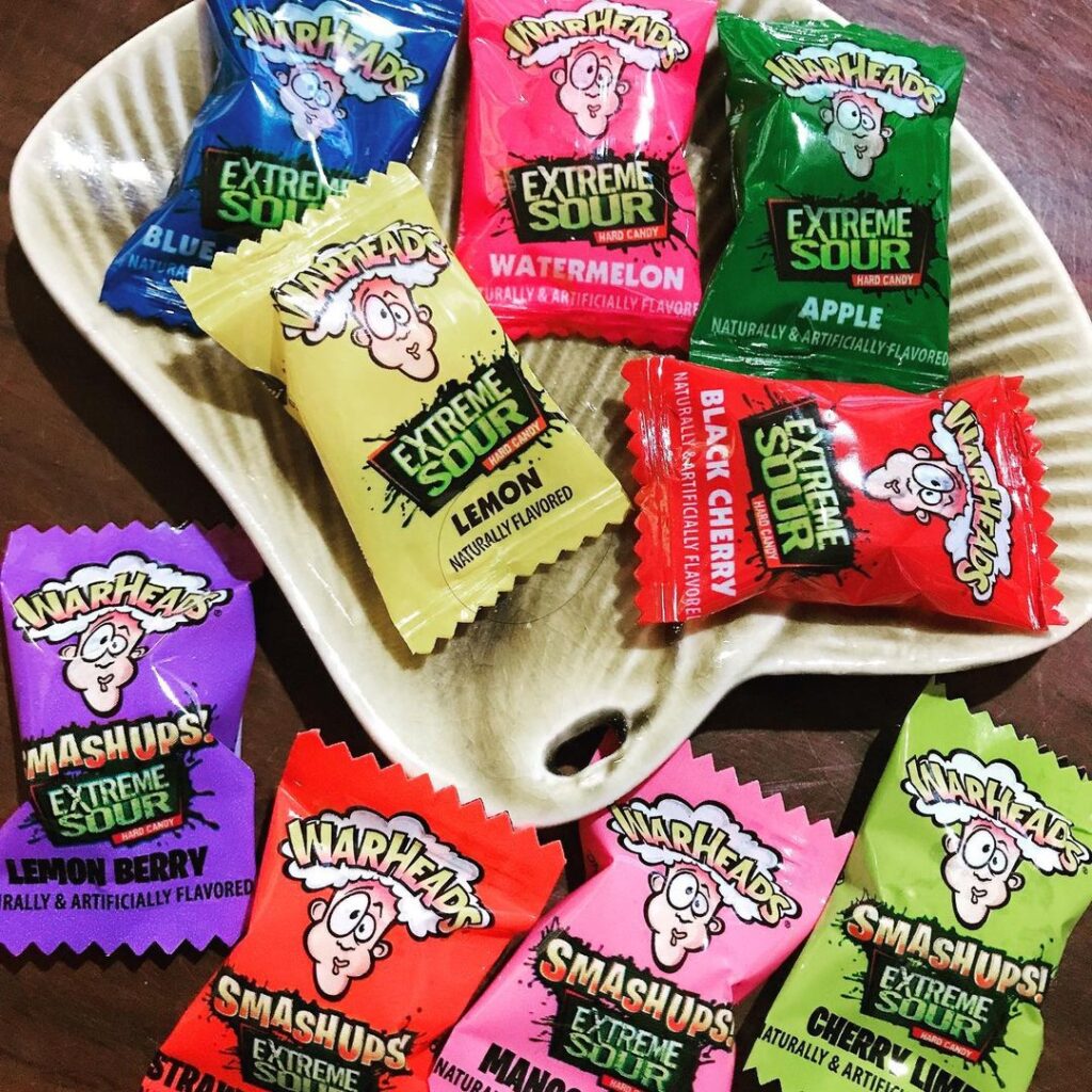
Warheads candy is the delicious candy manufactured by Impact Confections. The candy is considered “extreme” and has an intense flavor. This candy is absolutely different from any other. Not only does it have a unique taste, but it also has an extraordinary logo.
The dominant color of the packaging is green. There is an animated person whose face looks like he just ate something very bitter. His head is “blown up,” and the wordmark “Warheads” is written in light pink and light yellow on the white “smoke.”
Swedish fish
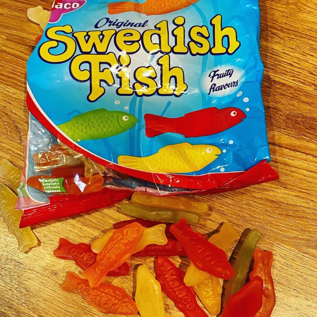
Swedish Fish candy arrived in the USA and became one of the most famous candies of the 1950s. The original logo had a simple wordmark alongside the cartoon fish. The current logo still contains the previous logo parts, but it is slightly different.
The Swedish fish logo is one of those candy logos that has a good amount of motion in it. The color of the fish represented on the logo is red, which matches the color of the treatment itself.
Airheads
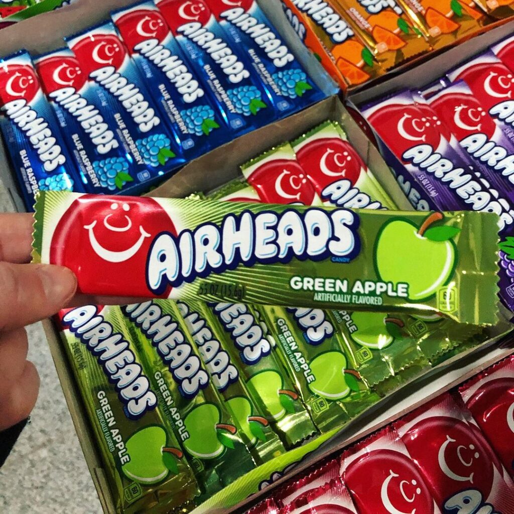
Airheads candy are a beloved childhood candy for many of us. It has a variety of intense fruit flavors and chewy textures. And who would not love the lovely, beautiful candy logo? The Airheads’ logo has the cutest, cartoon red balloon image on it. The balloon has eyes, a nose, and a smiley mouth, all in white. The wordmark is on the right side of the balloon. The colors white and blue are dominant on the pallet.
Bottom Line
The candy logos are a representation of the actual candy brands. They are not only a means of identification, but the sight of any of our favorite candy logos evokes memories of specific candy. Even without eating an actual treat, just the appearance of logos can bring a sweet smile to our faces.
Which are your favorite candy logos and what emotions come when you see them? Share your thoughts in our comment section below.
Frequently Asked Questions about Candy Logos
Who designed the Chupa Chups logo?
The Chupa Chups logo was designed by the legendary artist Salvador Dali. The logo was finalized and launched in 1969 as part of the candy's first major marketing campaign. Its flower-like shape with a yellow background and red lettering has become one of the most recognizable candy logos in the world.
What do the two M's in M&M's stand for?
The two M's in M&M's represent the initials of the candy's creators. The first 'M' stands for Mars, referring to Forrest Mars Sr., and the second 'M' stands for Murrie, referring to Bruce Murrie. This makes the M&M's logo both simple and deeply meaningful in its origins.
How many times has the Snickers logo been redesigned?
The Snickers logo has been modified several times since it was first introduced in 1939. A notable redesign occurred in 2005, when the logo frame became thinner, the capital letters were set at a uniform height, and a thin white shadow was added to give the letters more volume and depth.
What does the Milka logo and packaging represent?
The Milka logo and its signature lilac-colored packaging are meant to evoke a sense of luxury without being obtrusive, with the purple color playing a more significant role than in most other candy logos. The flowing font is designed to resemble milk, reflecting the chocolate's rich, milky nature. The name 'Milka' itself is a merger of two German words meaning 'milk' and 'cocoa.'
What is the significance of the colors in the Chupa Chups logo?
The Chupa Chups logo features a light yellow background with 'Chupa Chups' written in red, which creates what is described as a perfect balance of colors. The two words are styled differently: 'Chupa' uses a steadier font while 'Chups' features a more wavy or flowing style. The overall shape of the logo is flower-like, making it instantly distinctive and memorable.
Related Posts
Skor Bar: History, Packaging & Facts
Please leave a review or any memories of this snack in the comments at the end of this post. Snack History Nostalgia Rating: ⭐⭐⭐⭐☆…
Read more
Lemon Drops Candy: History, Origin & Flavors
Please leave a review or any memories of this snack in the comments at the end of this post. Snack History Nostalgia Rating: ⭐⭐⭐⭐☆…
Read more
Fruit Stripe Gum: History, Flavors & Availability
Please leave a review or any memories of this snack in the comments at the end of this post. Snack History Nostalgia Rating: ⭐⭐⭐⭐⭐…
Read more